|

The Rich and The Poor
Have you ever thought about the things you
might do if you were chosen to be the supreme (and hopefully benevolent)
dictator of the United States?
I don’t know what would be on your
agenda, but mine would certainly be to correct the way wealth is accumulated
and distributed in this country.
If you
divide
the wealth of the United States into thirds, you’ll find that the top 1%
of people own about a third, the next 9% own another third, and the bottom 90%
claim the rest.
Actually, these percentages, true a decade
ago, are now out of date. The top 1% are now estimated to own between 40 to
50% of the nation's wealth, more than the combined wealth of the bottom 95%.
Since
1973, median family income has grown very little. Early in this period, income growth fell
victim to oil price shocks and to a productivity slowdown -- this slow growth
of output per worker plagued most industrialized countries. Slow
growth affected people's outlook on economic life. When incomes grow rapidly,
more inequality means that the poor get richer but the rich get richer faster.
But when inequality increased in the ensuing slow-growth 1980s, some groups' incomes
fell in real terms. Between the business cycle peak of 1979 and the next
business cycle peak of 1989, the average income of the poorest fifth of
families fell from $10,900 to $10,200, while the average income of the top
fifth grew from $89,600 to $97,600. Moreover, the price of two key pieces of a
middle-class life—a single-family home and a college education—grew faster
than the general rate of inflation and faster than average incomes. For all of
these reasons, slow income growth played a key role in people's perceptions of a
vanishing middle class.
Look at this chart (based on US Census Bureau
information) which shows US workers' median pay growth from 1953 to 2003:
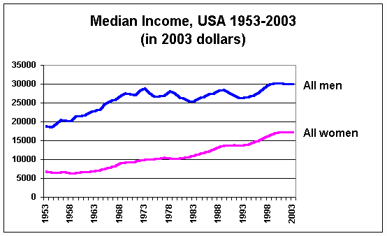
In this chart, it’s easy to see that from
1953 to about 1973, the American Dream was prevalent: The
general level of living was rising, and the future looked rosy. That was the
milieu I grew up in. Actually,
in every decade in
the 150 years before 1970 -- including the decade of the Great
Depression -- real earnings rose. But things changed, and for the last 30 years, median
male earnings have been about flat. We might as well be living in a feudal
society, where nothing ever changes. Were it not for hard-working females,
things would be mighty grim indeed!
You've heard the saying that "a rising tide
floats all boats". That was the shibboleth of Reagen's trickle-down
economic policy, and of other Neocons who have followed in his footsteps.
I see a good many luxury yachts floating high out there, but my little
average-man's dingy appears to have been swamped long ago, and now lays at the
bottom of the harbor.
How does US Government tax policy play into
this picture? Don’t these data imply that the average worker (not even
mentioning the underclass) is being left behind, and is no longer
participating in the American Dream? Shouldn’t we be looking at ways of
raising the general level of living? Or of redistributing the wealth more
equitably? Defensively, the more well-off will point to the "disproportionate"
share of taxes already paid by wealthy people. It
may be true that the top
few percent of high-income people are shouldering much of the tax burden. The
top 10% pay almost half of it. The top-earning 20% of taxpayers pay about 2/3 or more of the
entire US individual tax burden. The whining and the tears issuing from
the elite are pathetic -- and crocodilian.
I’ve heard the rich man’s lament that there’s "not enough money to go
around", even if the wealthy were to give all their assets away.
There’s just too many poor people out there. I previously bought into that
line -- with hook and sinker -- until I studied the US Census and IRS tax data
myself. Maybe this claim had some validity before so many people got so filthy
rich and green-greedy. But a casual glance of the modern tax data show this to
be a bogus, utterly bullhockey sentiment: very simply, the
wealthy are not paying their lawful fair share! And if they were made to do
so, we could (1) maintain equivalent tax receipts, (2) help the poorer
classes, and (3) provide a tax relief to all folks earning less than $200,000
annually.
To support these claims, I have to resort to showing a spreadsheet table
giving IRS data. This can cause most folks to "blank out", but the crux of the
matter is in the data. These particular data are from 1998:
|
(1998 IRS) Adjusted Gross Income (AGI) |
Number of returns |
Total AGI |
Avg Income |
Avg Tax |
Number of Taxable Returns |
Total Tax Amount |
Inferred Fed Tax Rate |
"What If" Tax Rate |
"What-If" Tax Amount |
Effect on Annual
Avg Income |
|
|
|
|
|
|
|
|
|
|
|
|
|
All returns, total |
124,770,662 |
5,415,972,846,000 |
43,407 |
8,475 |
93,047,898 |
788,541,979,000 |
|
|
790,467,274,019 |
|
|
No adjusted gross income |
994,831 |
-53,238,323,000 |
|
|
3,686 |
90,071,000 |
0.0% |
|
|
|
|
$1 under $5,000 |
13,218,016 |
34,994,426,000 |
2647 |
138 |
2,509,214 |
346,306,000 |
5.2% |
-7.0% |
-2,449,609,820 |
+323 |
|
$5,000 under $10,000 |
13,071,279 |
98,072,759,000 |
7503 |
325 |
5,748,485 |
1,865,460,000 |
4.3% |
-5.0% |
-4,903,637,950 |
+700 |
|
$10,000 under $15,000 |
12,901,535 |
161,358,792,000 |
12507 |
751 |
7,438,637 |
5,588,447,000 |
6.0% |
-3.0% |
-4,840,763,760 |
+1126 |
|
$15,000 under $20,000 |
11,724,272 |
204,713,422,000 |
17461 |
1259 |
7,926,390 |
9,979,019,000 |
7.2% |
-1.0% |
-2,047,134,220 |
+1434 |
|
$20,000 under $25,000 |
10,100,267 |
226,614,494,000 |
22436 |
1755 |
7,904,250 |
13,871,103,000 |
7.8% |
0.0% |
0 |
+1755 |
|
$25,000 under $30,000 |
8,192,496 |
224,639,427,000 |
27420 |
2278 |
7,460,565 |
16,993,257,000 |
8.3% |
3.5% |
7,862,379,945 |
+1318 |
|
$30,000 under $40,000 |
13,135,034 |
456,216,075,000 |
34733 |
3157 |
12,779,095 |
40,347,682,000 |
9.1% |
5.0% |
22,810,803,750 |
+1421 |
|
$40,000 under $50,000 |
9,973,659 |
447,072,777,000 |
44825 |
4538 |
9,875,704 |
44,814,557,000 |
10.1% |
8.0% |
35,765,822,160 |
+952 |
|
$50,000 under $75,000 |
15,886,502 |
969,792,123,000 |
61045 |
6876 |
15,840,056 |
108,921,128,000 |
11.3% |
10.0% |
96,979,212,300 |
+772 |
|
$75,000 under $100,000 |
7,221,303 |
618,463,031,000 |
85644 |
11810 |
7,214,883 |
85,209,356,000 |
13.8% |
13.0% |
80,400,194,030 |
+676 |
|
$100,000 under $200,000 |
6,266,258 |
822,620,525,000 |
131278 |
22947 |
6,263,188 |
143,720,694,000 |
17.5% |
17.2% |
141,490,730,300 |
+367 |
|
$200,000 under $500,000 |
1,606,186 |
463,589,644,000 |
288628 |
69496 |
1,605,059 |
111,545,246,000 |
24.1% |
24.1% |
111,725,104,204 |
-63 |
|
$500,000 under $1,000,000 |
307,020 |
207,594,481,000 |
676159 |
190608 |
306,822 |
58,482,844,000 |
28.2% |
30.0% |
62,278,344,300 |
-12239 |
|
$1,000,000 or more |
172,004 |
533,469,193,000 |
3101493 |
853978 |
171,862 |
146,766,804,000 |
27.5% |
46.0% |
245,395,828,780 |
-572709 |
There are a number of things to note in this table. The total individual
1998 earnings were about $5.5 trillion, with about $0.75 trillion taken in as
personal income taxes (this chart doesn’t include corporate tax receipts).
First of all, consider how many tax dollars are "confiscated" from folks
living at or below the poverty line. That seems like a crime and a sin to me.
Secondly, notice how many people submitted tax returns with AGI over $1
million – over 170,000, with the average income of that group being about $3
million each. Thirdly, regardless of the complaints about the high marginal tax rates imposed on the wealthiest population segment,
the "inferred" tax rate (what they actually paid) is not anywhere near that
rate. The ultra-rich seem to always find ways to avoid their lawfully defined
fair share of tax. Their net tax rate
is actually less than the next-lower wealth group!
You'll notice that in my "what-if" columns I included negative tax
rates for those whose AGIs were less than $20,000. For someone who is poor,
what's the most direct means of help you can give 'em? Would you ever
consider cold, hard cash money? Horrors! But I can afford
to be magnanimous to everybody when the rich are made to pay up!
You can figure out from the above data the percent contribution of the top
5 income groups (those whose adjusted gross incomes were over $75,000/year in
1998) and see that they amount to about 2/3 of the total IRS individual tax
revenue. Focus just on the top 2 groups, those with AGIs over $500,000.
They made 14% of the wealth, and paid 26% of the taxes. How sad! They remained
despicably wealthy. Let’s look at the red "what-if" columns and rearrange the
"effective" federal tax rates for everybody. If you could bump up
just the last 2
groups’ effective rates (those earning $500,000 or more), you could reduce just about
everyone’s tax rates significantly, give lots of money (with "negative"
tax rates) to the poorer groups, and end up with equally as much money coming
into the IRS coffers as before. And what is the impact to those half million
or so economic aristocrats? The Squires with an average income of $676,000 lose a
measly $12,000 more a year, and the big-time Barons averaging over $3 million
a year get whacked with a half-million dollar extra tax bill – which I consider to
be a justly "persuasive" contribution to our country's future health.
Everybody else is either unaffected or gets a real tax boon. Bottom line
conclusion: the rich guys have more than enough to pull the rest of us
up to a decent level of living – in recognition of the fact that it’s our
hard work that keeps them up there.
Years ago, our tax system used to be much more "progressive" at these
stratospherically high income levels. As recently as 1980, the top
marginal tax rate for any income over about $500,000 (in 2003 dollars) was
70%. Now it's a paltry 35% -- and as we see above, what they actually
end up paying is only 27.5%. It's time to return to that more
progressive tax policy
and "make it stick" -- if for no other reason, than to punish the filthy rich
(and their political cronies) for having taken such increasing advantage of the poor and middle classes
for the last 30 years.
On another page, I previously explored
data illustrating the dramatically increasing rate of wealth accumulation by
the ultra-rich. I don’t have a lot of sympathy for them, nor do I fool myself
any longer into thinking that what is to their benefit, is to mine as well.
They’ve pummeled the American Dream to within an inch of its life. Shame on
them! Shame!
Back to Essays...
Image at top from Pravda Rumania: Let's
all look at the Capitalist swine, ignoring the underclass. Capitalist
swine! Capitalist swine! Heads will roll, Capitalist swine!
According to the Spectrem Group, a firm that
specializes in wealth research, the
number
of millionaire households in the United States grew in 2004 to a record
7.5 million, up 21 percent in one year, according to surveys cited in the May
25 Wall Street Journal. This very wealthy segment of the population now
controls an astounding $11 trillion in assets.
These guys said it all better.
|